To commence this project, we first had to understand how important a design system is before presenting it as a solution to any user problem.
After taking an in-depth look at existing design systems we noticed that at first glance they look like they are made for designers, but upon use we realized that they catered more to the needs of developers
To be sure that this was a general problem we decided to conduct research amongst other product designers and see what they had to say.
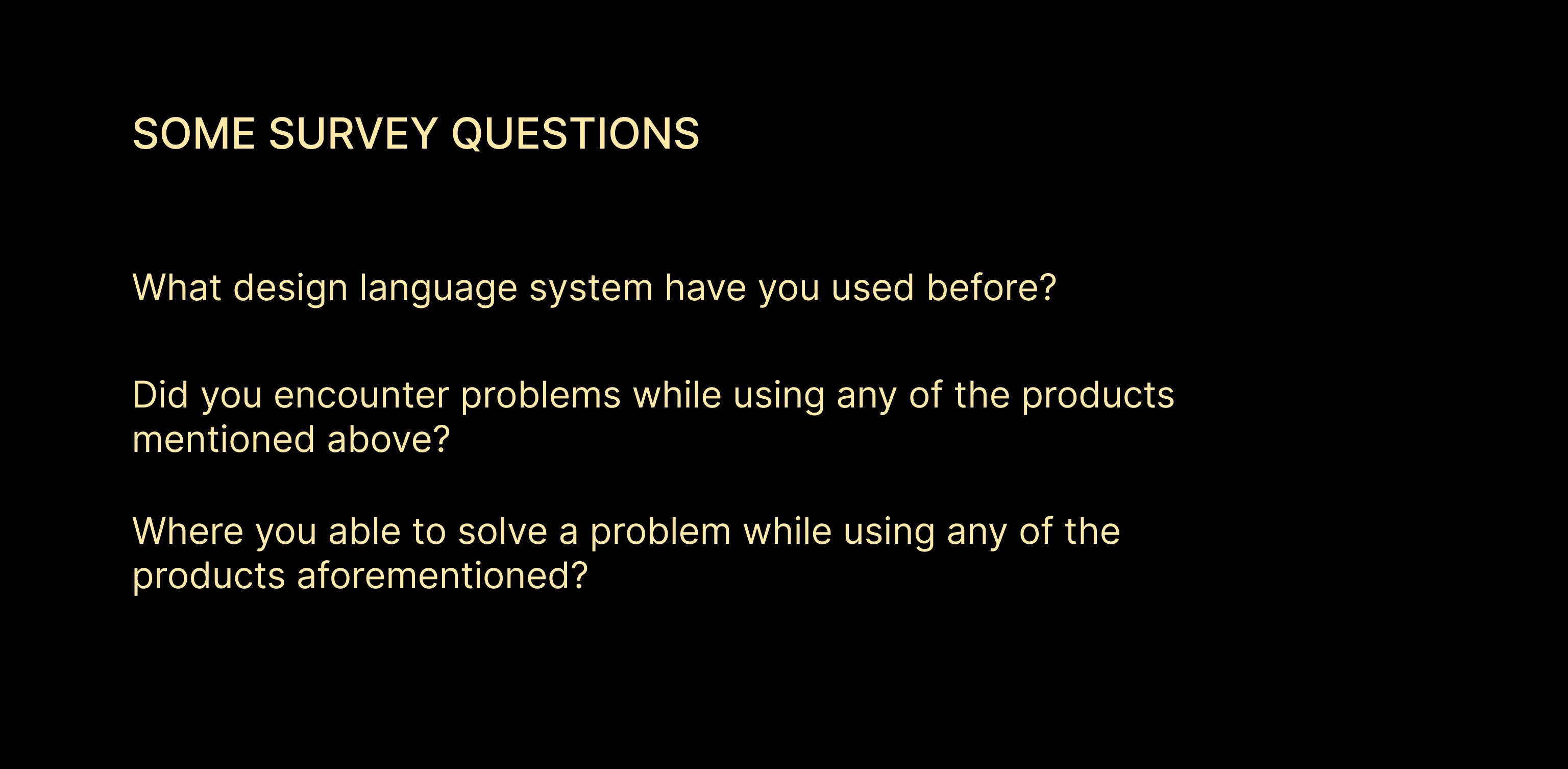
Upon analysis of a total of 82 responses, we discovered that our earlier assumptions were right.
Using the results from our research, we determined that creating a tool that not only increases the work speed of designers both old and new but also helps the team in general produce more consistent user experiences will help bridge the gap between design and development.
Design blocs specifically adopts the layout of carbon design system but with less complexity. We decided on this because of how easy and straightforward it was to navigate.
Based on all the information we have gathered up to this point we started to think about what we needed for the documentation. So, we put together a list of basic requirements like ;
All this was used to make low fidelity wireframes of the website layout that we had visualized.
To create a basic user flow we made use of just one pathway which we used to show how the user would navigate through one of the sections to eventually arrive at their goal.
To finalize our product we conducted tests among 5 product designers, who were selected based on previous evaluations. The study lasted for a duration of 30-60 minutes.
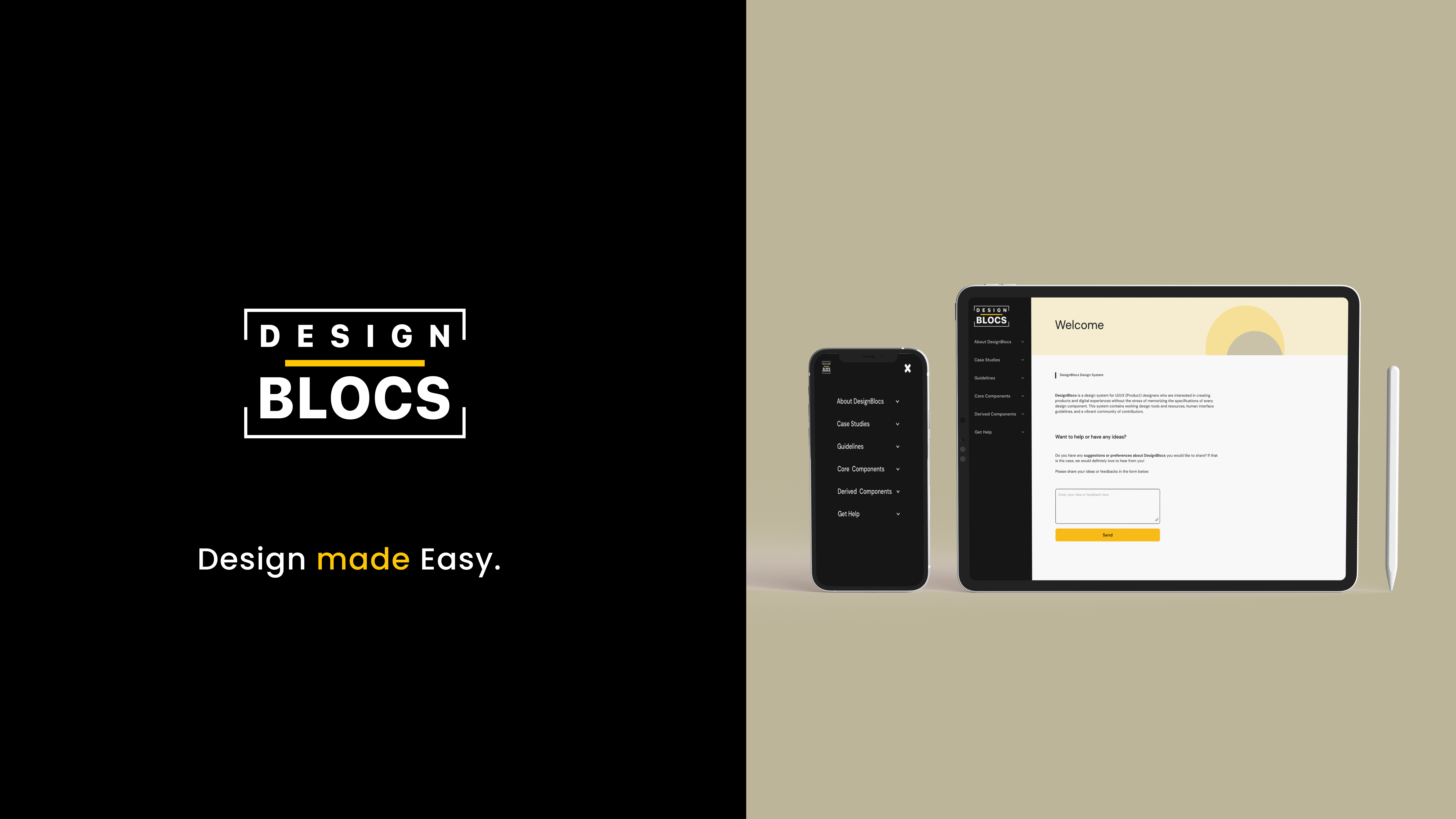
Below are some screens that show some key parts of the product
This project was really tasking, but it also served as a channel to learn a lot as designing and developing a documentation site requires a lot of iterations which in turn gives me new insights into certain things.