The conceptualization of this product was conducted in 4 phases and this involved a lot of collaborations, team work and refining of ideas.
First we were split into teams that each had to really understand and define user pain points and to do this we interviewed real people who were either business owners or consumers as they are the archetype for this specific product.

Based on the responses given to some of the questions we asked we were able to gather key insights that allowed us figure out our next steps.
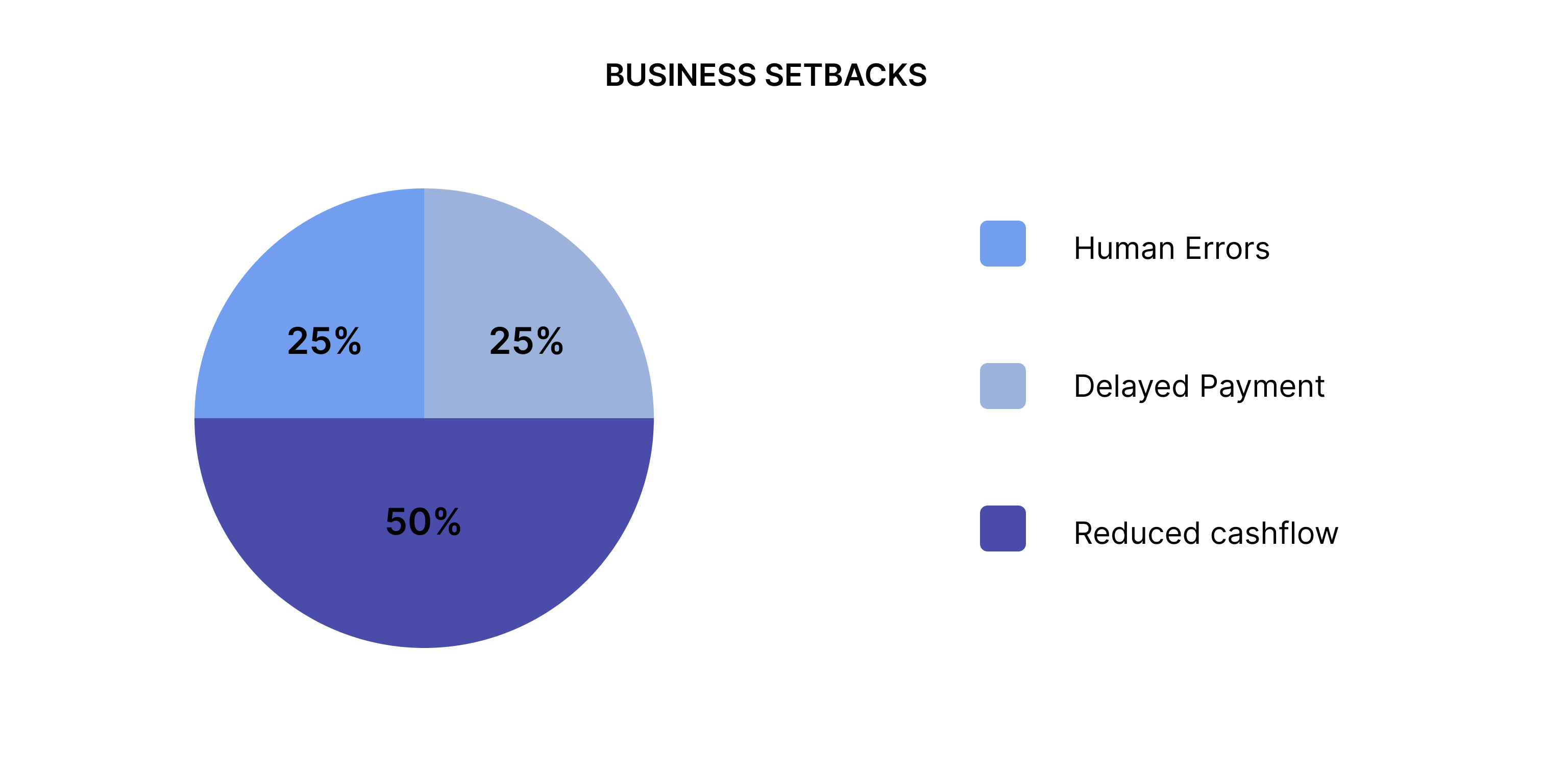
After this the teams converged and we made use of the key insights to get a definitive problem. The users had a lot to say and this allowed us understand their problems to a good extent, here are some of their thoughts.

Once a problem was determined we dispersed into our various teams to come up with possible solutions, ideas were brought up and analyzed till we settled on one that properly aligns with our user needs. At this point user flows were made,
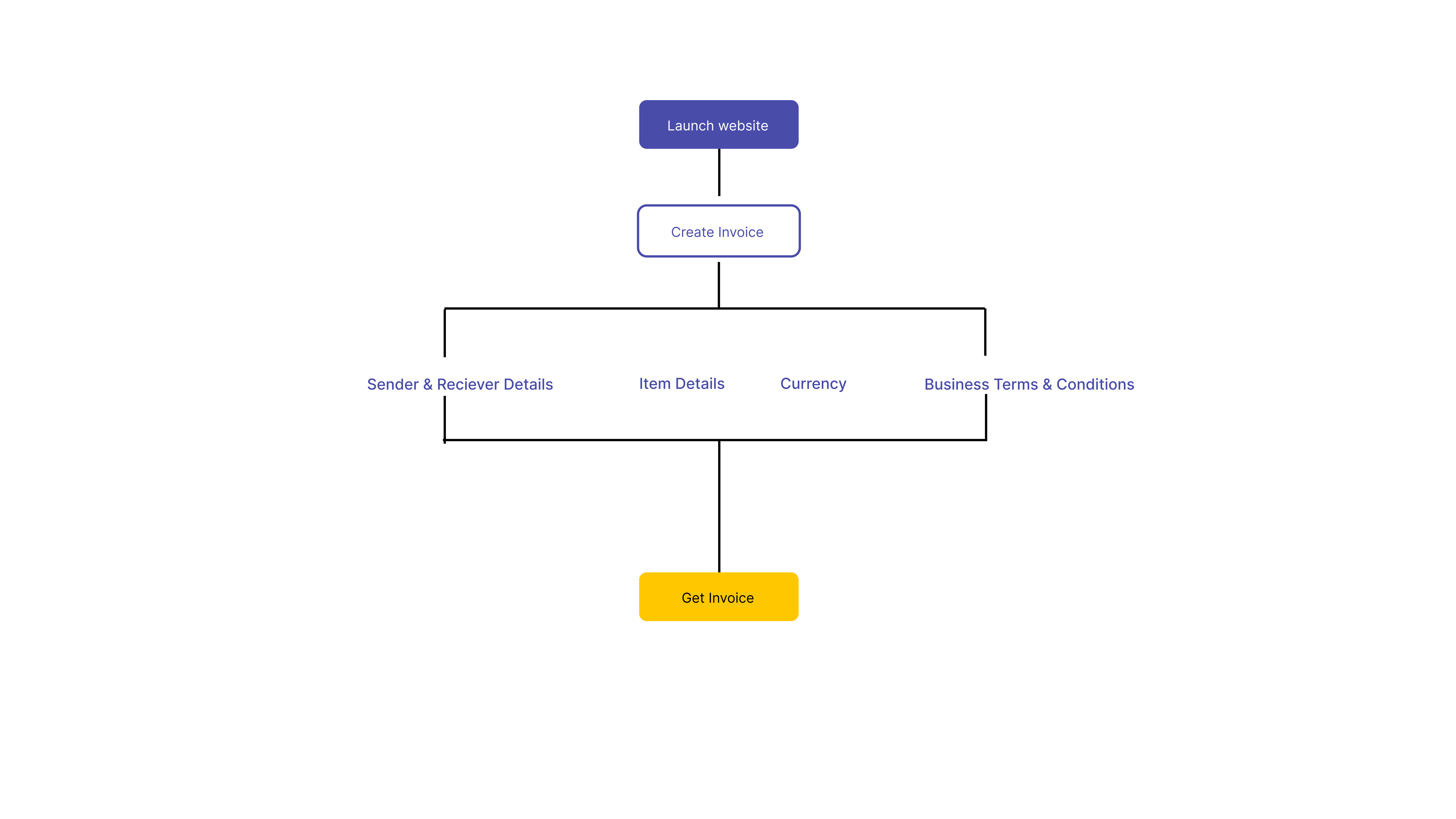
With the help of the user flow which serves as a visual guideline we were able to determine some of the screens needed and so sketches of those were drawn up.
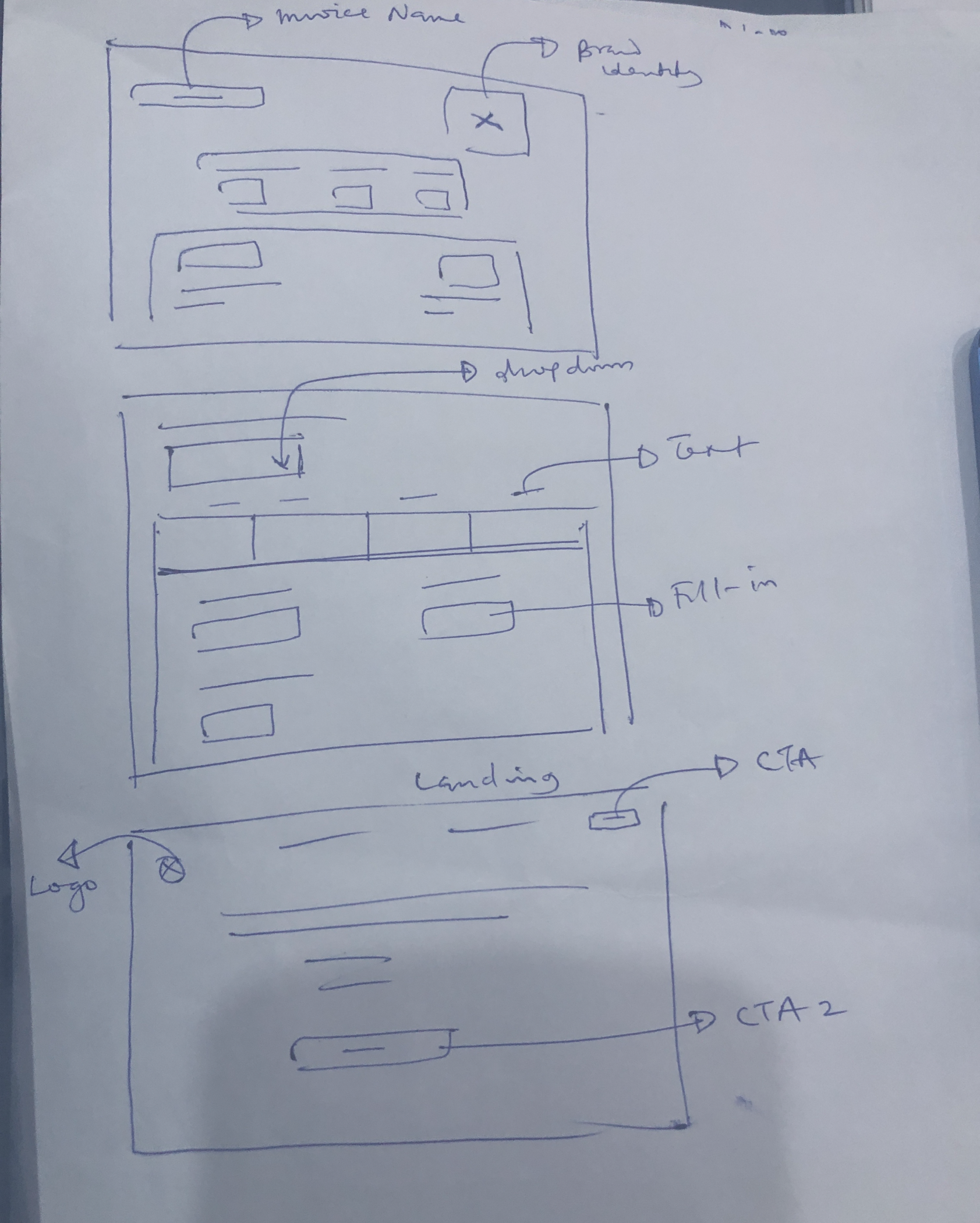
While taking reference from the sketches we were able to design the low-fidelity version of the product, to move forward we had to get feedback on what users think of the product. So we conducted tests that could answer questions like,
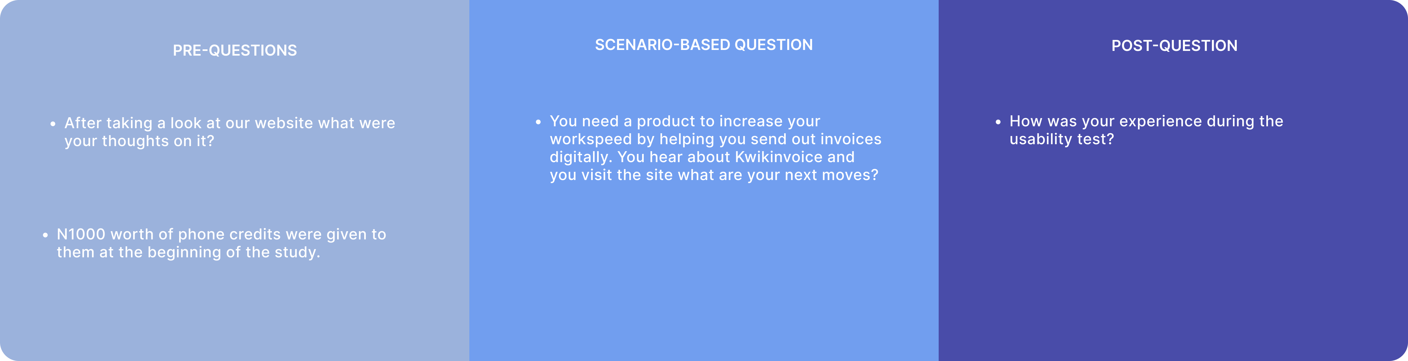
To conduct an in depth usability test with new users we outlined detailed documentation were we determined our 5W's and 1H. This helped us create a prompt that focused on the problem we were trying to solve.
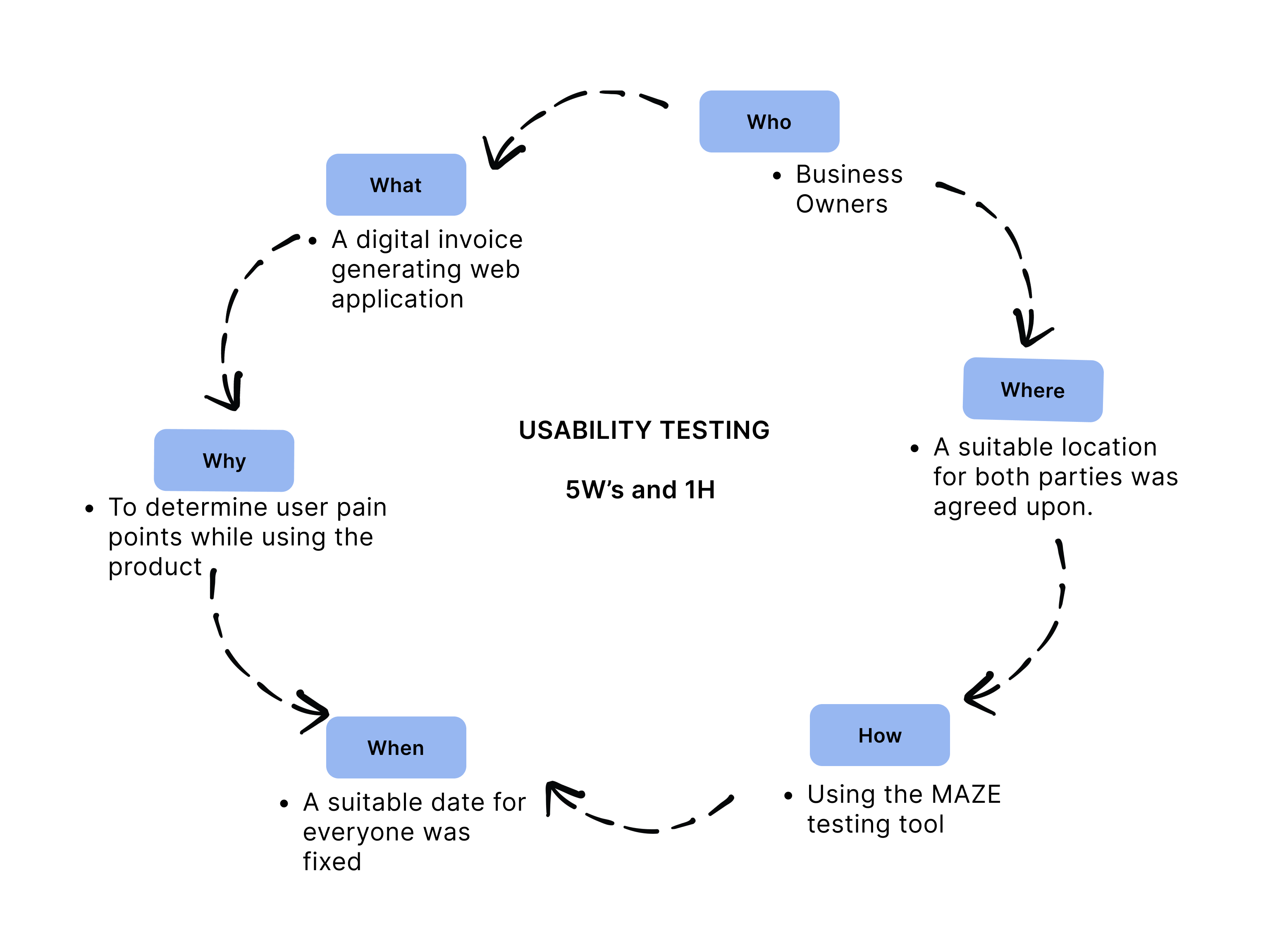
Once the prompt was approved by the senior product design, we got together 10 participants to conduct the user testing on ; most of which were participants of our earlier survey.
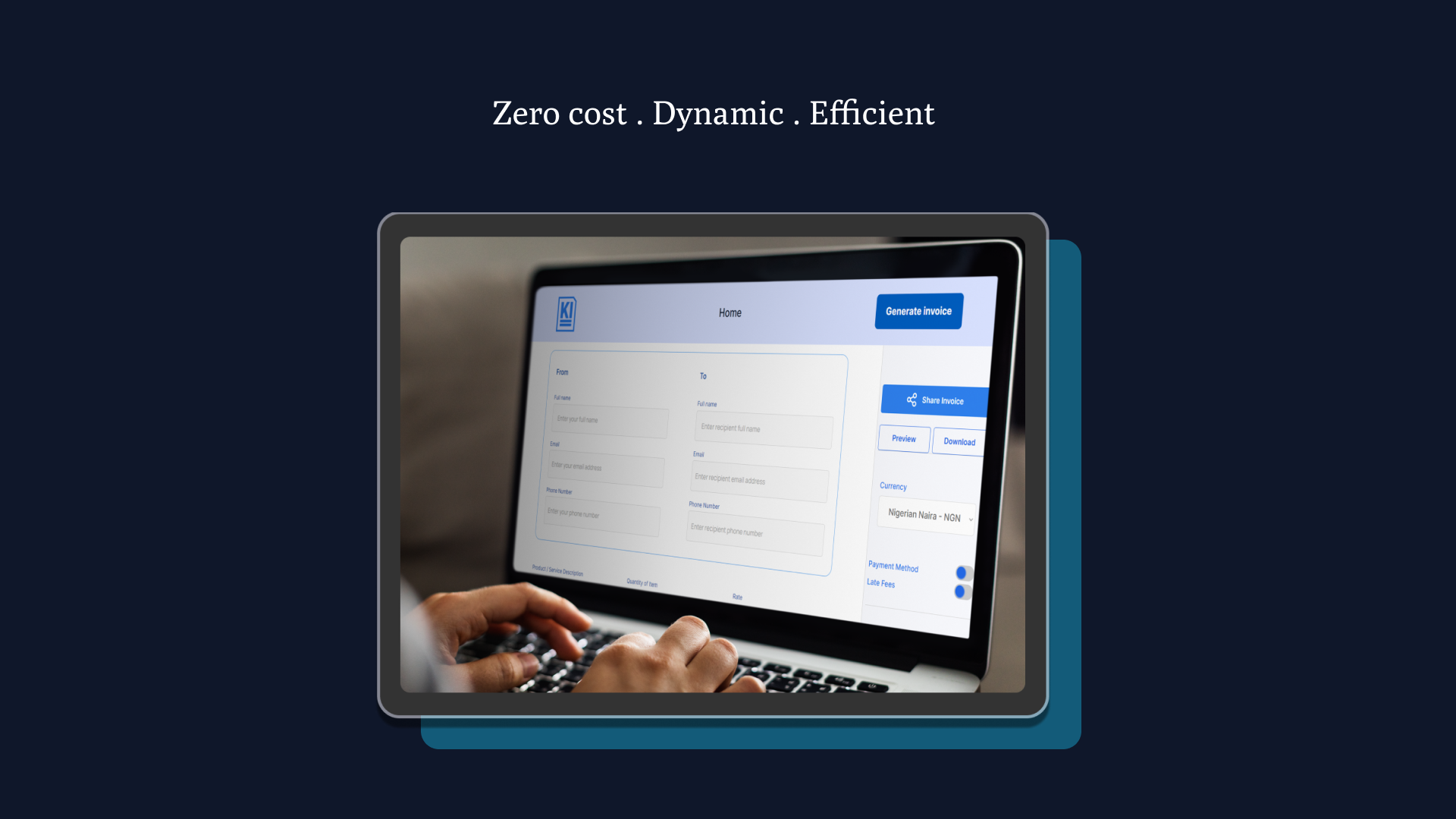
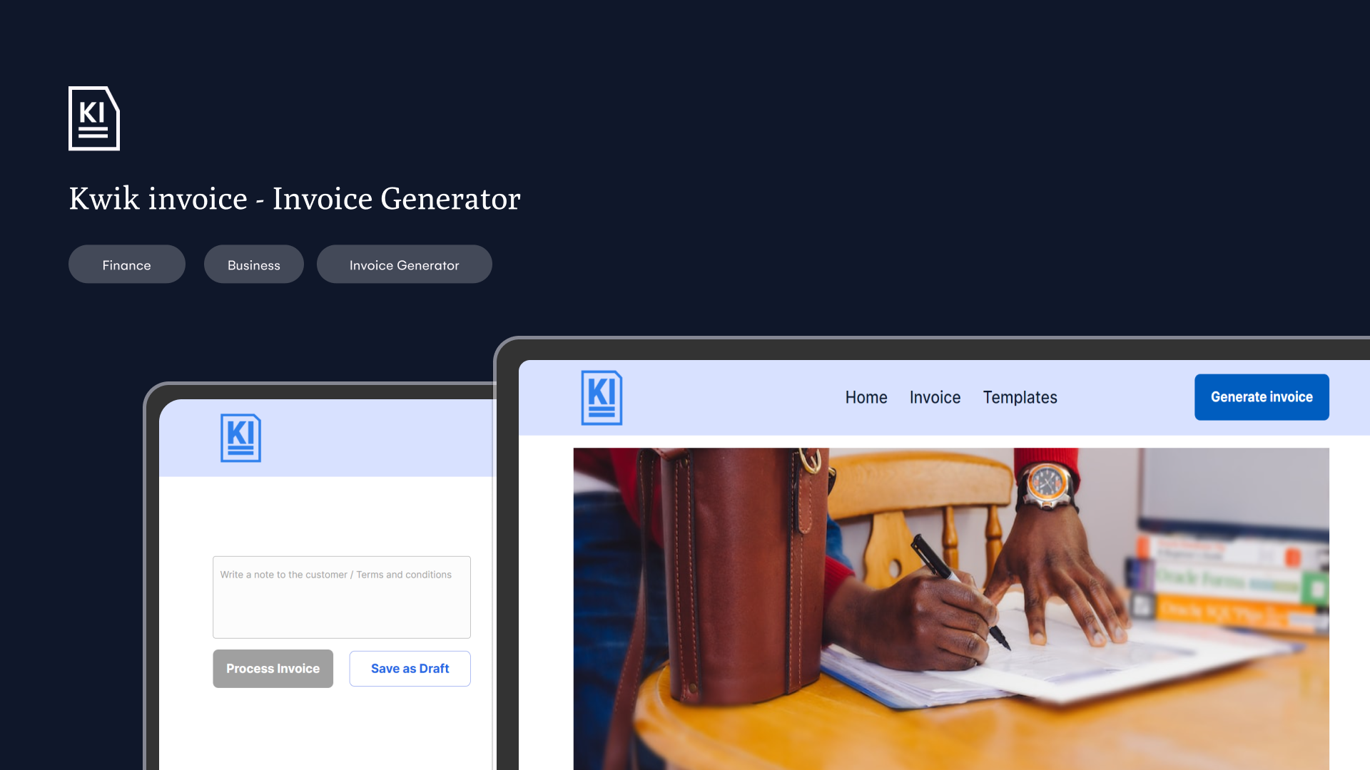
Based on the results gotten from the tests, iterations were made to the design and we proceeded to create the high fidelity prototype . Here is a preview of some key screens from the final design.